The Ultimate Guide to App Store Screenshot Sizes
App Store screenshots are the first look at your labor of love — your app.
These screenshots serve dual purposes; they meet the publishing criteria for the App Store and influence users' choices related to app downloads.
These screenshots offer a quick peek into your app's integrity and aesthetic and play a vital role in App Store Optimization. Harnessing them can lead to remarkable increases in user appeal, just like successful apps such as Sweatcoin.
Our ultimate guide will take you on a deep dive into the world of App Store screenshots. We will explore the varying app screenshot sizes and industry best practices and draw from the success of top-performing apps.
Let's optimize the appeal and performance of your app screenshots.
Why Are App Store Screenshots Important for ASO?
It may seem like a minor detail in the grand scheme of an app's launch, but screenshots can significantly impact your app's visibility and downloads on the App Store.
They're of primary importance for multiple reasons:

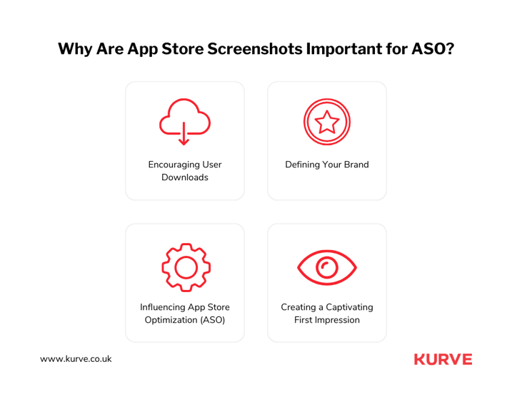
- Encouraging User Downloads: App Store screenshots are an immediate visual cue of what your app is about, which can influence a user's decision to hit that download button.
- Defining Your Brand: Screenshots portray your app's brand identity. It’s a silent promotional tool that communicates your app's uniqueness to its possible audience.
- Influencing App Store Optimization (ASO): While keywords and descriptions are crucial, screenshots are essential for ASO and indirectly affect your app's App Store ranking.
- Creating a Captivating First Impression: Screenshots often catch the user's eye before they even read the app's description. Striking visuals can make all the difference, compelling users to delve further into the app's features and, perhaps, download it.
Need we say more? Screenshots deserve a pivotal spot in your app marketing strategy.
What Makes a Good Screenshot?
Crafting a good App Store screenshot is an art that requires a strategic mix of design and marketing skills.
Let's take a look at the characteristics that make a screenshot compelling and influential:

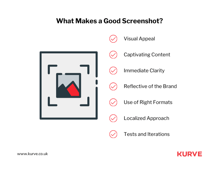
- Visual Appeal: Adopt a clean design focusing on your app's unique features. We recommend a minimalist approach to maintain an uncluttered, inviting appearance.
- Captivating Content: The content in the screenshots should convey the core values of your app succinctly without overwhelming the viewer.
- Immediate Clarity: A good screenshot instantly conveys the core functionality of your app. The salience of your app's primary features should be made apparent.
- Reflective of the Brand: Screenshots should mirror your app's brand, design scheme, and essence. They must complement the app's character, strengthening the brand's recall value among users.
- Use of Right Formats: Always adhere to the mandated format. For instance, the Apple App Store often requires flattened JPEG or PNG files with 72 dpi- without transparency.
- Localized Approach: Opt for a localized strategy if your app caters to different geographical regions to enhance user-relatability.
- Tests and Iterations: Continually A/B test your screenshots and use this user feedback to iterate and improve your strategy for success.
The aim is to build a visually engaging connection between your app and potential users, leading to more downloads and tremendous success.
App Store Screenshots Requirements and Guideline
We've explored the power of a good screenshot in captivating potential app users. Following hot on its heels, it’s time to discuss requirements and guidelines.
Complying with these regulations is the key to ensuring your app captures eyeballs across both these platforms. Whether you're catering to iPhone users or reaching out to the Android population, we've got you covered.
Apple App Store
Creating visually engaging screenshots is one side of the coin; navigating the technical requirements is the other.
-
iPhone Screenshot Sizes
The iPhone demands specific screenshot dimensions. As developers, it's essential to know these details.
For example, the iPhone 12 Pro Max and iPhone 13 and 14 Pro models need screenshots at 1284 x 2778 pixels. For older models, like the iPhone 8 Plus, your screenshots should be 1242 x 2208 pixels.
-
iPad Screenshot Sizes
With iPads, your canvas gets larger. Your screenshots for an app run at a standard 9.7-inch high-resolution display will be 1536 x 2008 pixels. For larger 12.9-inch displays, the screenshot size increases to 2048 x 2732 pixels. Comprehending these requirements helps ensure visually compelling images are displayed perfectly on iPads.
-
macOS Screenshot Sizes
Switching to macOS, Apple has unique requirements for screenshot sizes. Precise pixels matter; getting screenshot sizes to the dimensions suitable for the desktop experience is paramount. Screenshots for macOS devices can range from 1280 x 800 pixels to 2880 x 1800 pixels or higher.
Correctly tailoring your screenshots to suit macOS is vital. Doing so can elevate your app's visibility and enhance the overall user experience, making your app more appealing.
-
tvOS Screenshot Sizes
Now let's turn our lens towards the Apple TV, running on tvOS. The world of larger screens means more significant opportunities and different screenshot dimensions.
High-quality, attractive graphics of 1920 x 1080 pixels or 3840 x 2160 pixels can capture the viewer's attention, making your app more than just a part of their leisure time but a memorable part.
-
watchOS Screenshot Sizes
Finally, highlighting the small but mighty Apple watches powered by watchOS is essential. With models sporting unique resolutions, such as 410 x 502 pixels for Ultra and 396 x 484 pixels for Series 7 and 8, the challenge lies in delivering high-impact visuals in a limited space.
But the challenge becomes an opportunity when viewed through a creative lens. Showcasing your app's convenience, functionality, and intuitive design is vital to a great user experience on this platform.
Remember, by leveraging every screenshot slot available, you're expanding opportunities to engage potential users. Each slot is an opportunity to showcase your app's functionality and design; making the most of it is essential to your app's success.
Google Play Store
Let's dig into the Google Play Store screenshot requirements. Understanding these can help optimize your app's presentation to potential Android users.
Unlike its counterpart, the Play Store offers more flexibility with screenshot size specifications. It accepts a wide range of images, from a minimum size of 320 pixels to a maximum of 3840 pixels. These should be in either JPG or 24-bit PNG formats.
Despite this flexibility, specific sizes are recommended for different device types.
For instance:

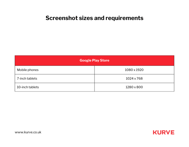
- For mobile phones, 1080 x 1920 pixels is a good start.
- For 7-inch tablets, consider using 1024 x 768 pixels.
- For 10-inch tablets, an image size of 1280 x 800 pixels is recommended.
These aren't stringent rules but guidelines that enhance the user experience. Acting on them can help clarify your app's benefits and features.
Adjacent to this is the strategic use of captions within screenshots. The Play Store grants the freedom to add short captions, adding context to the visuals. These can meaningfully communicate the core abilities of your application.
Likewise, picture orientation can significantly impact the user experience. Landscape or horizontal orientation provides a broad view, delivering an immersive experience. In contrast, portrait or vertical ones concentrate on individual features, making them stand out.
Testing different orientations is essential to make the most of these. See what better connects with potential users and results in more downloads.
Best Practices for App Store Screenshots
Each app is distinct. Its unique selling points should be communicated efficiently and attractively to set it apart from the competition.
In the following sections, we will dive into the best practices for screenshot creation.
Identify the Screenshot Order
The order in which you arrange your screenshots is a strategic and critical decision. Consider it as your app's storytelling sequence. The correct order can give potential users a captivating peek into your app's journey while focusing on its main selling points.
The first 2-3 screenshots are paramount. Most users make download decisions by glancing at these initial images. Therefore, start with your most vital, most impactful screenshots.
For instance, if your app offers multiple functionalities but stands out for its immersive user interface, let your first screenshot display that. It can immediately convey the superior user experience that awaits potential users, enticing them further into exploring your app. The following screenshots should complement the first ones, providing additional insights into your app's functionality.
Lastly, a note of caution. Never randomize your app screenshots in order. While it may seem tempting to bring variety, it might need to be clarified for users, overshadowing your app's core message.
The First Screenshot Must be the Most Compelling
Your first screenshot is your first impression – and you have a fraction of a second to convince a potential user to explore your app further.
So, this first impression should articulate the essence of your app, its main features, unique selling points, or a blend of all these.
Let's take the example of Airbnb. It uses its first screenshot to showcase a beautiful property in a stunning location — the dream of every traveler and the core appeal of the platform. This approach speaks volumes about Airbnb's offerings and appeals to potential users' emotions, enticing them.
Remember, potential users will only scroll through some of your screenshots. So, task your first screenshot with the heavy lifting—make it tell your app's story at a glance and inspire action. It calls for a thoughtful balance of design, content, and strategy, but when done right, it can significantly raise your app's download rates.
Build a Story from the Screenshots
Creating a narrative with your screenshots is crucial for captivating potential users. A well-told story walks them through the app's features and allows them to imagine themselves using it.
Here are some best practices to build a story with app screenshots.
- Focus on user experience: Highlight your app's user journey, logically showcasing its features and benefits. From onboarding to in-app interactions, let users experience how simple, enjoyable, or valuable your app can be for them.
- Show before and after transformations: Emphasize app benefits by demonstrating a problem-solution format. Show the challenges your app addresses or the goals users can achieve with it.
- Use relatable characters or situations: Display real-world scenarios to help users relate better to your app. Humanize your offerings and create a strong connection with potential users.
- Highlight social proof: Build credibility and convey the app's popularity by incorporating user testimonials, industry recognitions, or metrics showcasing success.
Building a story from your screenshots takes potential users on a journey that transforms their understanding and feelings about your product, ultimately moving them closer to hitting that download button.
Genuinely Show What the App Does
Presenting the genuine functionality of your app through App Store screenshots is crucial. Potential users need to see what they can expect when using your product. Follow these best practices to showcase your app's real-world capabilities effectively.
- Showcase core features: Focus on prominent features your app delivers and demonstrate its value proposition and how it can address users' pain points or satisfy their needs.
- Use realistic content: Include representative content in your screenshots to give users an authentic feel for your app, reflecting varied use cases and users' preferences.
- Visualize functionalities: Whenever possible, demonstrate the unique functionalities of your app visually.
- Emphasize ease of use: Reassure potential users of your app's simplicity and user-friendliness. Emphasize clutter-free interfaces, user control or ease of navigation through multiple features.
- Display device-specific functionality: Different devices might have unique capabilities tied to your app. For example, a health app with Apple Watch compatibility could show Heart Rate monitoring, step counting, or workout tracking directly from the watch.
Showcasing your app's functionality demonstrates reliability, eases concerns about its performance, and helps potential users envision themselves using the product.
Highlight the App's Main Feature
Your app's primary feature is the reason potential users seek it – and it deserves the spotlight.
Highlighting your app's main feature starts with understanding what separates your app from others. It could be a specific functionality, a unique approach, or a much-desired solution it provides.
Keeping your app's main feature in focus doesn't mean overshadowing other features. They are part of your app's appeal and deserve recognition in their own right. However, when a potential user views your screenshots, your app's key offering should be immediately apparent.
Lastly, affirm the credibility of your main feature. If your app boasts a standout feature validated by notable recognitions or testimonials, leverage that social proof in the Screenshot. It adds trustworthiness and further signals value to your potential users.
Showcase User Review
The power of peer feedback in driving user decisions is well documented, and as a result, featuring user reviews in your app screenshots can be a persuasive, solid element.
The goal is to select user reviews that encapsulate what makes your app unique. Focus on reviews expressing satisfaction with your app's main feature beyond a simple 'great app' testimony.
Composing a selection of different review snippets within a single screenshot can create a powerful testament to your app's quality, versatility, and popularity. Given that aggregation websites, forums, and social media are thriving user review platforms, crediting these reviews can further solidify their authenticity, and displaying logos of recognized platforms adds credibility.
An important consideration is that a sea of perfect scores can create skepticism. Striking a balance by presenting realistic ratings, such as 4.3 or 4.7, can maintain authenticity.
Incorporating user reviews optimally in your App Store screenshots can significantly elevate user trust, showcase the value of your app, and increase download rates.
Use Readable Text
When developing screenshots for the App Store, the readability of the text is vital. The text must be easy to read and understand at a glance, given that potential users often make quick judgments on whether an app meets their needs. Some key considerations:
- Font size: Choose a font size suitable for mobile viewing to ensure your screenshot text is readable. Too small enough, and the details become a guessing game; too large, and key points may get lost off-screen.
- Font color and contrast: A color that blends too much with the background might make the text difficult to distinguish, while excessively contrasting colors can be jarring and distract from your app's features.
- The power of whitespace: Using sufficient whitespace around your text can make it stand out more and provide breathing space for the eye, improving readability and reducing clutter.
- A straightforward typeface: Overly elaborate fonts can distract from the message you're trying to convey.
Localize Your Screenshots
Successful mobile apps often cross cross-cultural and geographic boundaries, making localization a vital aspect of effective marketing. This means translating and adapting your visuals for screenshots to resonate with different user demographics.
Localizing involves:
- The correct language: This goes beyond mere translation; ensure your screenshots' text captures the nuances and colloquialisms of the local language.
- Localizing visuals: Feature local landmarks or familiar landscapes in the background. Imagine a travel booking app showcasing Germany's Brandenburg Gate for German users. It connotes relevance by highlighting localized experiences users can connect with.
- Beware of cultural differences: Etiquette, symbols, colors, icons and gestures can mean different things in different cultures.
- Localize info: Make sure dates, units of measurement and currency symbols are correct.
Localizing your screenshots tells your potential users that your app was designed with their preferences. It increases their chance of connecting with your app, enticing them to install and explore your offering.
Do A/B Testing
Embracing a data-driven approach is indispensable for effective app marketing. Thus, conducting A/B testing for your app store screenshots can help optimize performance and drive higher conversion rates.
The basic principle is to identify the KPIs you want to test for, such as increased installs, higher engagement rates, or decreased app uninstalls, and then create two versions of the screenshots to see which drives better results.
There are several practical A/B testing tools on the market, such as SplitMetrics, Storemaven, or Google Play Store Experiments if you're targeting the Android market. These platforms allow you to conduct controlled experiments to see how your target audience responds to different screenshots.
Monitor the test for an adequate period, typically several weeks, to gather relevant data. Often, it's best to conduct multiple rounds of testing and iterate on your designs based on what you learn.
Through A/B testing, you understand what your users engage with, allowing you to make informed decisions, refine your app's presentation, and amplify your app's success potential.
Famous Examples of App Store Screenshots
Now, we focus on some industry-leading apps notable for their successful use of innovative and practical app store screenshots. These well-known applications include Tinder, TikTok, Uber, and Instagram.
Each hosts unique strategies in their screenshot designs, strategically distinguishing themselves in a crowded marketplace. These case studies serve as an abundant source of insights, providing actionable lessons from their success.
Their expertise in harnessing the power of visuals and crisp messaging will offer valuable lessons.
Tinder
Look at Tinder's screenshots in the app store, and you'll see they focus on easy use and social ties. The images highlight a simple user interface, showing the user that the app is easy to navigate.
Bright, attractive colors, which match Tinder's overall brand, are used in these images. It's an excellent example of how developers can use consistent branding in their app store visuals.
The screenshots show the app in use and call out Tinder's unique features. They use captions to quickly explain to the prospective user what value they'll get from the application.
Moreover, the sequence of screenshots takes the user on a journey. They tell a story that helps potential users imagine what using Tinder would be like. The approach creates a compelling and engaging screenshot set that encourages users to download the app.
TikTok
TikTok's app store screenshots reveal a few effective tactics. Their dynamic, colorful, and social-centric visuals capture attention while reflecting the nature of the app.
These screenshots prioritize user-generated content, emphasizing the app's social interactive platform. They mirror the app's essence, providing an authentic peek into the user experience. Clear and concise captions are employed in their screenshots, conveying the app's purpose and benefits in a quick read.
TikTok also smartly integrates short video clips within their app store listing. This enhances the showcase of their multimedia-centric platform, suggesting that sometimes, it's best to show what your app is about, not just tell.
Uber
Uber's app store screenshots utilize a few practical strategies. Firstly, they keep their interface in focus, underlining the app's ease of use and straightforward functionality. This alone teaches the importance of allowing the interface to speak for itself without any unnecessary clutter.
The screenshots also make clever use of captioned text, shortened for clarity. They highlight the app's essential features, delivering the main value propositions quickly and precisely. This approach shows an example of to-the-point content, a valuable method for remembering.
Uber's iOS app store page screenshots also employ a monochromatic color scheme, resonating with their overall brand identity. This consistency lends a professional look, underscoring the significance of maintaining a robust and coherent brand throughout the app store visuals.
Finally, the app previews and screenshots simulate a prototypical user journey, demonstrating the app's service from booking to ride completion. This offers potential users a lucid picture of what to anticipate, thus encouraging them to download.
Instagram's app store screenshots highlight the app's core features, maintaining consistent branding and using a mix of visuals and captions that accurately convey the app experience.
The images focus on the platform's social features - sharing visually appealing content and engaging with others through likes, comments, and direct messages.
These screenshots display a mix of user-generated content along with app interface elements. This combination effectively captures the essence of Instagram, allowing potential users to envision their experience within the app.
Simple yet informative captions drive home the main features and functions of the app. Clear communication is essential here, as users should quickly grasp the app's purpose and benefits through captions.
Instagram's color scheme is consistent with its brand identity, creating a visually appealing and unified look. The harmony of colors highlights the value of maintaining a coherent aesthetic throughout the app store visuals.
The Art of the Screenshot
Creating engaging app store screenshots is as much an art as a strategy. This crucial detail of app marketing is about communicating your app's purpose and features and understanding and appealing to your target audience.
Have you found the insights shared in this blog valuable for your mobile app business? If yes, your next smart move could be reaching out for professional guidance. Here at Kurve, we have a team of experts who can significantly aid in harnessing the full potential of your mobile app's marketing strategy.
Explore how Kurve's mobile app marketing services can help you turn these insights into tangible results. Our expertise could give your app the competitive edge it needs in the rapidly evolving app marketplace.
Remember, the success of your app is not just about its conception and development but also about the strategic marketing of your product. Partner with Kurve today and navigate your way to success in the app universe.


