How Sweatcoin Grew in Japan by Localizing Brand Assets


Download case study
The Challenge
Approximately 70% of all App Store users discover and download apps directly through search. App screenshots establish their initial interaction with a brand. The imagery and message they see influence their first impressions and significantly affects conversion rates.
Our client Sweatcoin, the fastest-growing health and fitness app in history, approached us to localise their App Store assets for the Japanese market as they had identified significant differences in conversion rates compared to other regions. The Kurve team was tasked with providing guidance on effective strategies to localise Sweatcoin to the Japanese audience.
The main challenge was to understand what would work in a key market with very unique aesthetics and ways of visually presenting and consuming products. The objective was to create a set of recommendations outlining the best design patterns, type of content, language and calls to action that would lead to improved conversion rates and stronger growth.

The Solution
Research
We started by researching Sweatcoin’s direct competitors within the health and fitness category and analysing their localised screenshots in the Japanese market.
We also looked at global businesses and their overall design and communication strategies. For example, we mapped out the screenshots of leading social networks across different markets and compared the assets of top consumer brands such as Nike and Coca-Cola to identify trends and differences between the US and Japan.

We used data intelligence tools including data.ai, AppTweak and MobileAction to analyse the A/B testing results of competitors’ activities in the Japanese app store. A/B testing allows brands to experiment with different design elements within a screenshot and understand which variations resonate best with their audience.
This process can involve several iterations with progressively smaller changes to finally create the asset that will generate the best possible conversion rates. Researching competitor’s A/B testing helped us identify trends and validate our key assumptions.
Findings
A key finding about the Japanese audience is that they are used to processing a lot of information within the same screenshot and enjoy seeing multiple designs and text elements combined in one single image. This is a stark difference compared to other markets.
Japanese culture has a long history of integrating language into images (manga and emojis are clear examples). This helps explain why more elaborate assets combining visuals and text proved to be the most popular.

We also experimented with using vibrant colours and landscape-oriented images while including bold social proof messaging to validate product quality and generate instant trust.
It’s important to note that the Japanese writing system uses syllabic characters and characters representing entire words, unlike the Roman alphabet). Considering language compatibility for text length and spacing is essential.

“Implementing Kurve’s ASO insights at the time of our launch in Japan enabled us to create a familiar and native brand perception in this new market. Our high-converting App Store listing accelerated our growth and helped us scale successfully.”
Irina Ashkenazy
Sweatcoin, Head of Growth
The Results
Sweatcoin’s team created localised app store assets for Japan based on the research and insights provided by Kurve, which allowed us to progress with our own A/B testing. This phase helped us refine brand assets by understanding how to best present Sweatcoin’s product and focus on the offers and features that would be most appealing to a Japanese audience.
The work of localisation continues as we monitor the data and Sweatcoin’s assets are periodically reviewed.
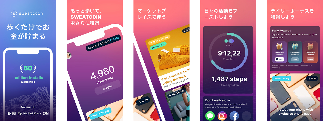
Before the first test

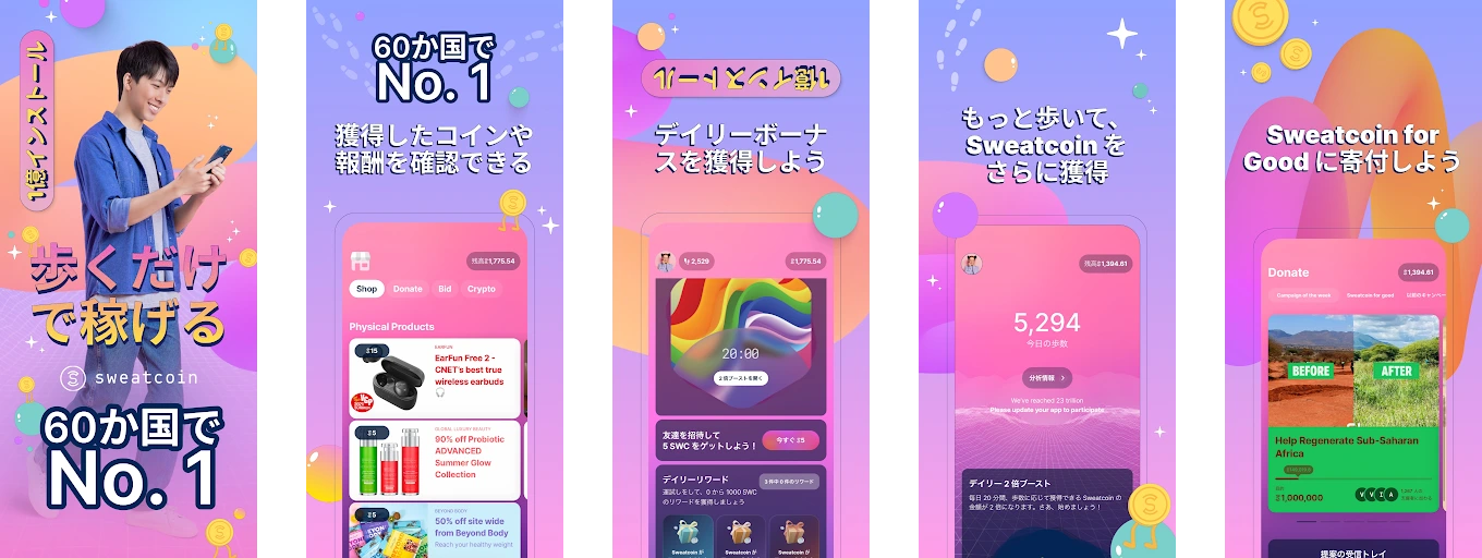
After the first test

Want to localise your brand to a Japanese audience?
Reach out to us!
Present your product using vibrant colours and multiple design and text elements in one screen
Sweatcoin found that avoiding too much negative space works.
Focus on what truly resonates with the audience
Japanese users loved Sweatcoin’s rewards!
Stay true to your key branding but create country-specific design patterns
Sweatcoin replaced their polished 3D animated designs with strong social proofs and text.
Strategic App Growth Experts
