The Science Behind App Landing Pages That Convert
It's a competitive market out there.
But having a remarkable landing page can make all the difference.
The best companies in the industry understand this. It's why they invest in crafting interactive and visually appealing landing pages that captivate users at first glance.
At Kurve, we're passionate about helping businesses succeed in the digital landscape, and we've helped many clients create captivating landing pages for their mobile apps.
This in-depth guide will walk you through creating a mobile app landing page. We'll discuss the crucial elements of a high-converting landing page and share best practices. We'll provide actionable tips to help you build a compelling page that grabs the attention of your target audience, drives conversions and fosters growth.
What is a Mobile App Landing Page?
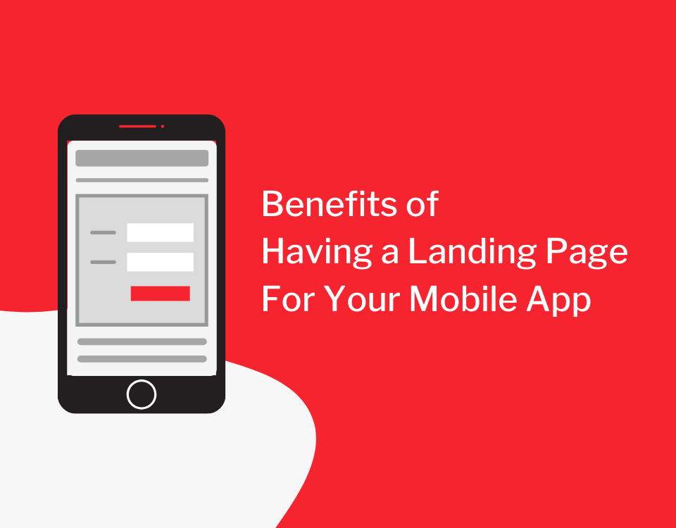
A mobile app landing page is a web page designed to promote and showcase your mobile app.
The landing page serves as the first point of interaction between potential users and your app. It offers them a glimpse into the app's features, benefits and user experience. The primary goal of a mobile app landing page is to entice visitors to take action. It could be to download the app, sign up for a newsletter, or engage with your brand in another way.
An effective mobile app landing page includes engaging visuals, persuasive copy, and a clear call-to-action (CTA) that guide visitors toward the desired outcome. By highlighting your app's unique selling points and addressing users' pain points, you can capture the attention of your target audience and drive conversions.
A mobile app landing page is a powerful marketing tool that can not only attract new users to your app but also contribute to its long-term success. By creating a beautiful app landing page that resonates with your potential users, you'll be well on your way to achieving growth and standing out in the competitive app market.
How Can Landing Page Benefit Your Mobile App?
An engaging and well-designed landing page can be a game-changer in the competitive mobile app market.
For business owners and entrepreneurs, investing in a captivating landing page is essential to maximize the potential of their app and drive its growth. The impact of an excellent mobile app landing page goes beyond the aesthetics. It can improve conversion rates, generate more traffic, enhance brand image and create a lasting impression on the audience.
This section will explore the many benefits of a well-crafted landing page for your mobile app, helping you unlock its true potential and thrive in the competitive landscape.
Increase Conversion Rates
A well-designed landing page can boost conversion rates by highlighting your app's unique features and benefits. By addressing users' pain points and offering solutions, you create a compelling narrative that entices visitors to take the desired action.
A clear and strategically placed CTA also plays a crucial role in driving conversions and guiding users toward the next step in engaging with your app. Ultimately, this results in increased revenue and growth for your mobile application.
Generate More Traffic
An optimized mobile app landing page can improve your app's search engine rankings. This, in turn, attracts more organic traffic to your website. By incorporating relevant keywords, providing valuable content and ensuring a seamless user experience, you enhance your online visibility and make it easier for potential users to discover your app.
A well-executed landing page is critical to driving more traffic and conversions for your app. More traffic means more potential users, increasing your app's reach and its chances of success in the competitive market.
Present Your Brand's Objectives
A landing page offers a unique opportunity to communicate your brand's objectives and vision to potential users. You can create a solid emotional connection with your audience by showcasing your app's unique selling points and illustrating how it aligns with users' needs.
This connection fosters trust and loyalty, making users more likely to engage with your app and brand in the long run. A well-crafted landing page that presents your brand's objectives can contribute to building lasting relationships with your target audience.
Enhanced Brand Image
An aesthetic, professionally designed landing page can elevate your brand's image. High-quality visuals, intuitive navigation and a consistent design create a positive impression on visitors. These signals make potential users more likely to engage with your app and brand.
This enhanced image and improved user experience further solidify your app's position in the competitive market and increases the likelihood of user retention.
Greater Impact on the Audience
A well-crafted landing page can impact your audience, encouraging them to share your app with friends and social networks. With social sharing buttons and incentivizing referrals, you can leverage the power of word-of-mouth marketing and expand your app's reach.
Creating a memorable and engaging experience for your audience can inspire users to become brand ambassadors multiplying your landing page's impact and driving more organic growth for your mobile app.
Essential Elements of a Landing Page for an App
To create a high-performing landing page, it's crucial to incorporate elements that resonate with users and guide them through decision-making.
These fundamental components work harmoniously to showcase your app's value proposition. They also reinforce your brand's credibility and encourage visitors to take the desired action. This section explores the essential elements of app landing pages. We'll discuss their significance and provide insights on optimizing each component for maximum impact.
These fundamental elements include;
- page headlines
- subheadlines
- app functionalities
- features, benefits
- social proof
- striking graphics
- and a CTA button
By understanding and implementing these essential components, you can create a captivating and compelling landing page for your mobile app.
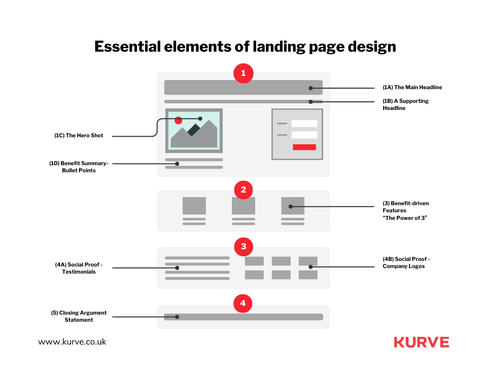
Page Headline
The page headline is the first element that captures your audience's attention. A compelling headline should be clear and concise and convey the primary value proposition of your app in a few words.
It's essential to immediately create a strong connection with your audience. The best way to do this is by addressing their needs and presenting your app's solution. A well-crafted headline can set the stage for the rest of your landing page, ensuring that users continue to explore the content and engage with your app.
Page Subheadline
The page subheadline complements the headline by providing more context and information about your app. While the headline grabs the user's attention, the subheadline dives deeper into the value proposition. It elaborates on the benefits and features of your app.
The subheadline should be persuasive yet informative. It needs to provide compelling reasons for users to consider your app. By expanding on the headline's message and addressing user pain points, an effective subheadline can further pique the interest of your audience and encourage them to continue exploring your landing page.
Mobile App's Functionalities, Features, and Benefits
Showcasing your app's functionalities, features, and benefits is crucial to a successful landing page. This section should clearly outline what your app does and the unique value it offers to users. Focus on addressing the pain points of your target audience and how your app can solve them.
Highlight the essential features and functionalities that set your app apart. Use concise, easy-to-understand language, and consider incorporating visuals, such as screenshots or short video clips, to demonstrate your app in action.
By effectively showcasing your app's features and benefits, you can persuade potential users of its value and relevance to their needs.
Social Proof and Testimonials
Social proof and testimonials are powerful tools to build trust and credibility for your app. By featuring positive reviews, case studies, or endorsements from satisfied users, you can demonstrate the real-world impact of your app and validate its effectiveness.
Include testimonials from diverse users to address pain points and showcase your app's versatility. Highlight industry accolades, awards, or partnerships that further establish your app's credibility. By leveraging social proof and testimonials, you can instill confidence in potential users and increase their likelihood of engaging with your app.
Striking Graphics
Striking graphics are vital in creating a visually appealing and engaging landing page. High-quality images, screenshots, and videos can convey your app's functionality, features, and benefits visually compellingly.
Consider using custom illustrations or animations to add a unique touch to your landing page and reinforce your brand identity. Ensure that your graphics are consistent with your brand's style and messaging. Well-executed visuals can enhance user experience, capture your audience's attention, and leave a lasting impression on potential customers and users.
Call-to-Action (CTA) Button
A clear and persuasive call-to-action (CTA) button is essential for driving conversions on your landing page. The CTA button should be prominently displayed, easy to find, and use action-oriented language to encourage users to take the next step, whether downloading your app, signing up for a trial, or requesting a demo.
Ensure that your CTA button stands out from the rest of the page with contrasting colors and a clear, concise message. Test different variations of your CTA to identify the most effective option for your target audience. A well-crafted CTA button can significantly boost conversion rates and contribute to the overall success of your app.
The 6 Ultimate Guide for Building Effective Mobile App Landing Page
Creating an effective mobile app landing page can significantly drive engagement and conversions.
In this guide, we'll walk you through six essential steps to build a high-converting landing page that resonates with your target audience and propels your app to new heights. You'll learn;
- how to set your conversion goal
- design an attractive interface
- prioritize mobile site optimization
- keep users interested
- demonstrate your app's value
- evaluate and improve your landing page
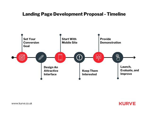
Each step provides actionable insights and strategies, ensuring you have the knowledge and tools to create a captivating and compelling landing page for your mobile app.
Let's dive into these six essential steps to transform your landing page and unlock your app's full potential.
1. Set Your Conversion Goal
Defining your conversion goal is the foundation for building an effective landing page. A clear goal helps you focus your efforts and design elements to drive users toward the desired action. For example, your conversion goal could be app downloads, sign-ups, or in-app purchases, depending on your app's objectives and revenue model.
Begin by identifying the primary action you want users to take upon visiting your landing page. Ensure this goal aligns with your overall app strategy and provides tangible value to your business.
By setting a specific conversion goal, you can measure the effectiveness of your landing page, monitor performance, and optimize elements to achieve better results. A well-defined plan is a guiding principle for every landing page design and messaging aspect.
2. Design An Attractive Interface
The design of your landing page plays a crucial role in creating a positive first impression and keeping users engaged. An attractive interface should be visually appealing, easy to navigate, and consistent with your brand identity. Focus on creating a clean layout that prioritizes readability and user experience.
Use high-quality visuals, such as images, illustrations and videos, to support your content and convey your app's value proposition. Implement a clear visual hierarchy to guide users through your landing page and ensure that essential elements, such as your CTA button, stand out.
A well-designed interface captivates users and makes it easy to understand your app's offerings and take the desired action. An attractive interface is vital for maximizing user engagement and driving conversions.
3. Start With Mobile Site
Prioritizing the mobile experience is essential when creating a landing page for your app. With most users accessing content through mobile devices, optimizing your landing page for mobile should be at the forefront of your design process. A mobile-optimized site ensures a seamless experience for mobile users, regardless of their device.
Implement responsive design techniques to adapt your landing page to different screen sizes and resolutions. Ensure that your content is easy to read, images are correctly scaled, and navigation is intuitive on mobile devices. Starting with a mobile-first approach allows you to focus on the essential elements of your landing page and deliver a consistent experience across all devices, increasing user satisfaction and conversion rates.
4. Keep Them Interested
Maintaining user interest throughout your landing page drives engagement and conversions. Focus on crafting compelling content that addresses user pain points, showcases your app's unique selling points, and keeps users engaged from the moment they land on your page.
Use a variety of content formats, such as text, visuals, and multimedia, to keep your audience engaged and cater to different learning preferences. Break up large blocks of text with headings, bullet points, and images to improve readability. Create a clear content hierarchy that guides users through your page and highlights the most crucial information.
Keeping users interested increases the likelihood of engaging with your app and taking the desired action.
5. Provide Demonstration
Demonstrating your app's functionalities, features, and benefits helps users understand your app's value and how it can address their needs. A clear and engaging demonstration on your landing page can significantly increase user interest and trust in your app.
Incorporate visuals, such as screenshots, videos, or interactive elements, to tangibly showcase your app's features and functionality. Highlight your app's most essential and unique aspects to differentiate it from competitors. Ensure your demonstration is concise and easy to understand, focusing on the benefits users can expect from using your app.
A practical demonstration can significantly enhance user comprehension and motivation to download or engage with your app.
6. Launch, Evaluate, and Improve
Launching your landing page is only the beginning of the process. To maximize its effectiveness, you must evaluate performance, gather user feedback, and improve based on data-driven insights.
Use analytics tools to track key performance indicators (KPIs). Some key metrics to consider are conversion rates, bounce rates, and user engagement. Identify areas of your landing page that you can optimize, and experiment with different design elements, messaging and CTA's to find the most effective combination.
Regularly evaluating and refining your landing page can ensure that it stays up-to-date, relevant, and optimized for maximum conversions and user satisfaction.
Mobile App Landing Page Inspiration
Were you seeking inspiration to create a captivating mobile app landing page?
This section showcases five exceptional mobile app landing pages. These examples demonstrate effective design, compelling content and innovative features, providing valuable insights you can apply to your landing page.
In each example, we'll highlight what makes them stand out and how they communicate their app's value proposition. By studying these successful landing pages, you'll better understand what works and how you can innovate or integrate similar elements into your app's landing page.
Let's explore these inspiring examples and learn from the best in the industry.
Carly
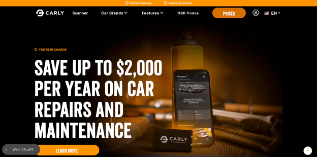
Carly is an innovative automotive app that unlocks your car's hidden potential. It provides valuable insights into its health and facilitates better maintenance and customization. Its landing page caters to users with diverse needs, directing them to the appropriate checkout flow for their car make and model.
The landing page showcases a strong value proposition and a clear CTA. It's followed by social proof elements such as client testimonials and a list of well-known clients. Users who scroll down encounter a comprehensive rundown of the app's benefits, features and functionality.
One noteworthy aspect of Carly's landing page is the strategic use of multiple CTAs, each targeting prospects based on their car type. This approach defies the typical one-CTA rule but works well for an app like Carly. Moreover, the page features an influencer testimonial, lending credibility to the app and driving user trust.
Carly's landing page demonstrates the importance of tailoring your page to match your app's unique offerings, keeping users engaged, and effectively funneling them toward the desired action.
Keeply
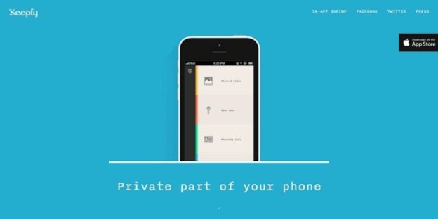
Keeply is a privacy-focused app that securely stores users' private files and data. Its landing page embraces minimalism, showcasing a single-column layout with a clear explanation of the app's purpose and a list of key benefits at the top.
The page presents the app's unique features and selling points as users scroll down, each section set against a different background color. This creative design choice enhances user engagement and helps maintain focus as they explore the app's functionalities.
The CTAs are strategically placed at the top and bottom of the page, with an App Store tab on the right side and a text link in the footer. Keeply's landing page demonstrates the effectiveness of concise copy and visually appealing design, ensuring only essential information is presented.
Using bullet points, compelling screenshots, and custom fonts further adds to the page's appeal. Keeply's landing page is a prime example of how simplicity and a focused design can impact users.
BigOven
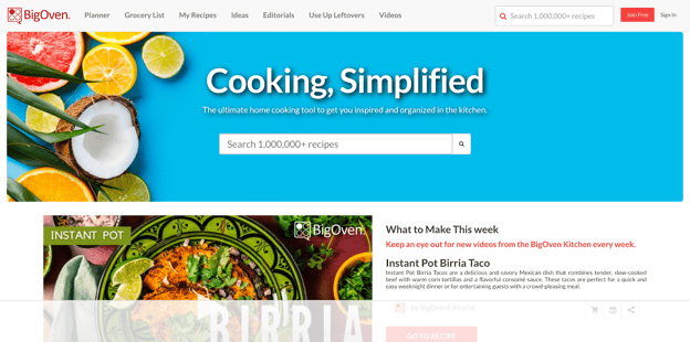
BigOven is a mobile app designed to enhance users' cooking skills and provide them with many recipes. The landing page effectively utilizes essential components of a successful app landing page, such as clear and concise copy, CTAs, value propositions, and demonstrative content.
The page showcases images of the app's layout and design and succinct descriptions of its capabilities. A vital landing page feature is the informative video, which explains the app's functionalities in-depth.
One of the standout aspects of BigOven's landing page is its focus on legibility. Large font sizes and easy-to-read typography ensure the content is accessible on various devices, including mobile phones. The headers effectively convey the app's benefits and unique selling points, making it easy for users to understand its value without reading the additional bullet points.
BigOven's landing page is a prime example of how prioritizing readability and clear communication can lead to a compelling presentation of an app's offerings.
Cash App
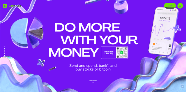
Cash App is a reputable mobile payment service that enables users to send, spend, bank and invest money. Backed by the well-established digital payment innovator Square, Cash App doesn't need an elaborate introduction or design to convince users of its credibility.
The app's landing page is a portal for setting up an account, downloading the app from the Apple App Store or Google Play, and accessing customer support. The minimalist design, combined with subtle visual elements like the blinking money symbol and moving graphics, effectively captures users' attention.
One standout feature of Cash App's landing page is the frictionless download process for desktop users. Instead of providing direct links to app stores or requiring users to input their phone numbers, Cash App employs a QR code. Users can scan the QR code with their phone's camera, and the link directs them to the app download page on their device.
This streamlined approach eliminates unnecessary steps and makes tracking QR code "clicks" easier, providing a more efficient and user-friendly experience.
FitnessAI
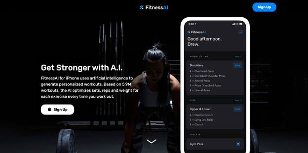
For beginners, entering the world of weightlifting can be daunting. FitnessAI aims to alleviate this intimidation with its iPhone app, which generates personalized workout plans based on data from over 5.9 million workouts. The app's design strikes the perfect balance between the physical aspects of weightlifting and the science of data analysis.
The landing page's hero image effectively captures the essence of weightlifting, featuring muscle and gunmetal gray tones. It explains the app's functionality and how its data-driven approach sets it apart from other weightlifting apps.
FitnessAI simplifies the concepts, making it easy for users to understand how the app works. Developed using Webflow, the design showcases how FitnessAI can help users sculpt their muscles, with data science guiding them every step of the way.
Get Started With Us!
A mobile app landing page is a powerful marketing tool. Creating an engaging and effective mobile app landing page boosts downloads, increases user engagement and contributes to your long-term success. It's time to take advantage of the insights shared in this article and make your app stand out in the crowded market.
With Kurve's Mobile App Marketing Services, you can create a powerful landing page tailored to your app's unique requirements. Our team of experts will guide you through the process, ensuring your landing page converts and drives your app toward success.
Don't wait any longer—dive into mobile app marketing and unlock your app's full potential with Kurve.
