Landing Pages for Paid Search: What You Might be Missing
It’s deceptively easy to get paid search wrong. For example, simply picking the right search terms to bid on offers plenty of opportunities for marketers to waste their ad spend.
Similarly, over-experimentation can waste valuable time and effort which would be better focused elsewhere. Additionally, Google, Facebook, Instagram, and other digital platforms each have their own nuances you’ll need to account for. However, where I see otherwise excellent PPC marketers slip up the most is: paid search landing pages.
Generally, landing pages underperform for one of two reasons: they get the fundamentals wrong or — more frequently — they fail to deliver enough contextually relevant value despite getting the basics right. Here, I’ll provide a crash course on the basics, and dive into what separates high-performing PPC landing pages from mediocre ones.
The table stakes: Basic PPC landing page best practices
Before we jump into what many miss about PPC landing pages, let’s make sure we’re all clear on the basics. Because everyone should be doing these things out of the gate , I consider them the table stakes of PPC landing pages.
1. Alignment between campaigns and landing pages.
This one should be intuitive. It’s imperative that the content on your PPC landing page is well-aligned with your ad campaign. If your landing page isn’t totally consistent with your PPC ads, users will quickly move on to something more relevant. As a result, you’ll see lower conversion numbers and poor ROI on your PPC spend. Additionally, lack of alignment between your PPC landing page and ad campaign means lower “Ad Relevance” which is a key component of your Google Ads Quality Score.
2. Content that builds trust.
People are clicking your ads because they want something. Whatever that something is — product, service, or information — your PPC landing page should position you as someone visitors can trust to provide it. For example, aggregated reviews (e.g. from TrustPilot ) and case studies are a great way to add social proof and build authority on your landing page.
3. “Fast” load times.
Page speed matters for PPC just like it matters for SEO. Google told us all this loud and clear back in 2018 , but even putting Google Ads aside, page speed matters. If your page takes too long to load, visitors will leave before they ever see your message. Again, this will mean lower ROI on your campaigns. How fast should “fast” be? The faster the better, but 2 seconds or less is a solid target for “good enough”.
4. Page design with PPC in mind.
Generally speaking, you can be more minimalist and laser-focused on PPC landing pages than pages designed with SEO and organic search in mind. Relevant headlines, UX that flows well, compelling CTAs, and copy that both builds trust and creates a sense of urgency all come into play here.
What even seasoned marketers miss about PPC landing pages
If you’ve been in the PPC marketing space for a bit, those four tips likely aren’t anything new. They’re certainly important, and there is some nuance behind getting them right.
But let’s be honest: following basic best practices alone isn’t going to make your landing pages something to write home about. Plenty of PPC campaigns include landing pages that seem to nail the basics but still underperform.
Often, the failure of these paid search landing pages is they focus too much on the product or service offered, and not enough on the real person with a real problem that found the page. In my experience, making the shift from a product/service focus to a user focus is what differentiates effective landing pages from the “paint by numbers” landing pages.
Of course, “focus more on users” is a bit too high level and abstract to be actionable. So, while that should be a guiding principle in all your marketing efforts, let’s go a little deeper and look at the specific techniques you can use in practice.
In my experience, the following four PPC landing page strategies all have these characteristics:
-
They are correlated with higher conversion rates
-
They are applicable across effectively all industries
-
They are often overlooked, even on landing pages designed by professional marketers
As a result, marketers have been able to consistently use them to revamp and optimise their paid search landing pages.
1. Mix up the CTAs at different stages.
There’s plenty of conventional wisdom out there that will tell you multiple calls to action are bad. The idea behind that conventional wisdom is reasonable enough: you don’t want to confuse or distract readers with conflicting messaging.
However, if we take a step back and consider the journey of a user on a landing page, we can see why strategically mixing your CTAs up a bit can actually be an effective strategy.
If your landing page has multiple similar CTAs as a user scrolls through the content, without clicking… why would they change their mind at the bottom of the page? If a user wasn’t convinced after your first CTA at the top of the page, chances are they still have some doubts.
Adapt your CTAs to account for those doubts as a user scrolls. For example, we do just that on Kurve’s paid search landing page.
We open with a straight and to-the-point “Let’s talk” button as a CTA. If a visitor knows they’re ready to talk, we’re sorted. Straight and to the point. However, not everyone is at that point, and they may need to learn more before pulling the trigger.
As the user scrolls down and reads more, we give them a “Get a quote” button. The logic here is simple: they may not be convinced yet, and a quote may provide just what they need to get over the hump. Further down, if a visitor still has doubts, we prompt them to see if we’re a fit.
2. Address pros and cons.
Often, landing pages focus only on the upside of a product or service. While highlighting the value you can deliver to your customers is important, it’s also important to understand the doubts and trade-offs running through your potential customer’s mind.
For example, suppose one of the biggest concerns your potential customers have is price. Here, tackling the cost head-on by demonstrating ROI on your landing page would be a smart move.
3. Value soft conversions.
Even the best landing pages won’t convert most visitors. However, there can be major upside in making soft conversions. A soft conversion is when a visitor takes some secondary action (i.e. not the sale or conversion that is the primary focus of your landing page), like subscribing to an email newsletter or downloading an eBook.
Visitors to your landing pages may not always be ready to make a purchase, but if you can give them something of value, you can start building a relationship. Further down the line, that may result in a conversion. Even if it doesn’t, it can build authority and goodwill for your brand.
Case-in-point: Eclipse, a UK-based eCommerce design agency, offers visitors a free report near the bottom of their UX and design landing page . 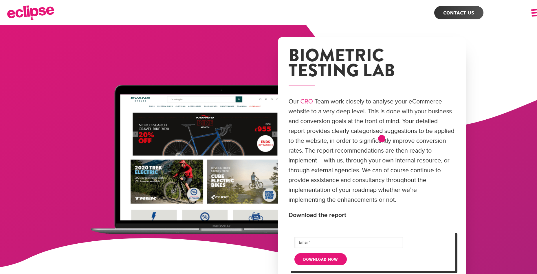 Given much of the conventional wisdom touted online, I know what many of you may be thinking: doesn’t this distract from the laser-focus a landing page should have?
While it’s true your landing pages should have a narrow focus, it’s important to remember that is a guiding principle not an unbreakable law. We’re dealing with real people that are at different stages in the buyer’s journey. Given that we know most visitors won’t convert, designing your landing pages to provide them with value and making a soft conversion before they leave helps set up hard conversions down the line.
💡Pro-tip: Get technical. Generic features and benefits talk on a paid search landing page don’t offer much value. Technical content like white papers, how-to guides, and eBooks can be great ways to generate soft conversions on your landing pages. Using Eclipse as an example, a user that wasn’t ready to talk to the agency today might derive value from a detailed report on customer journeys. Eclipse gives that to them and begins building a relationship as a result.
4. Make the page interactive.
Interactivity helps drive engagement and deliver value. One of the best examples of how to effectively add a layer of interactivity to your paid search landing pages is ROI calculators or similar budgeting and sizing tools.
Similarly, landing pages that guide visitors through a process to get to a conversion are a great idea. Uncommon Goods Gift Selector tool . It guides a visitor from their pain point (not knowing what gift to buy) directly to a solution and serves as an excellent example of user-focused CRO (conversion rate optimisation). 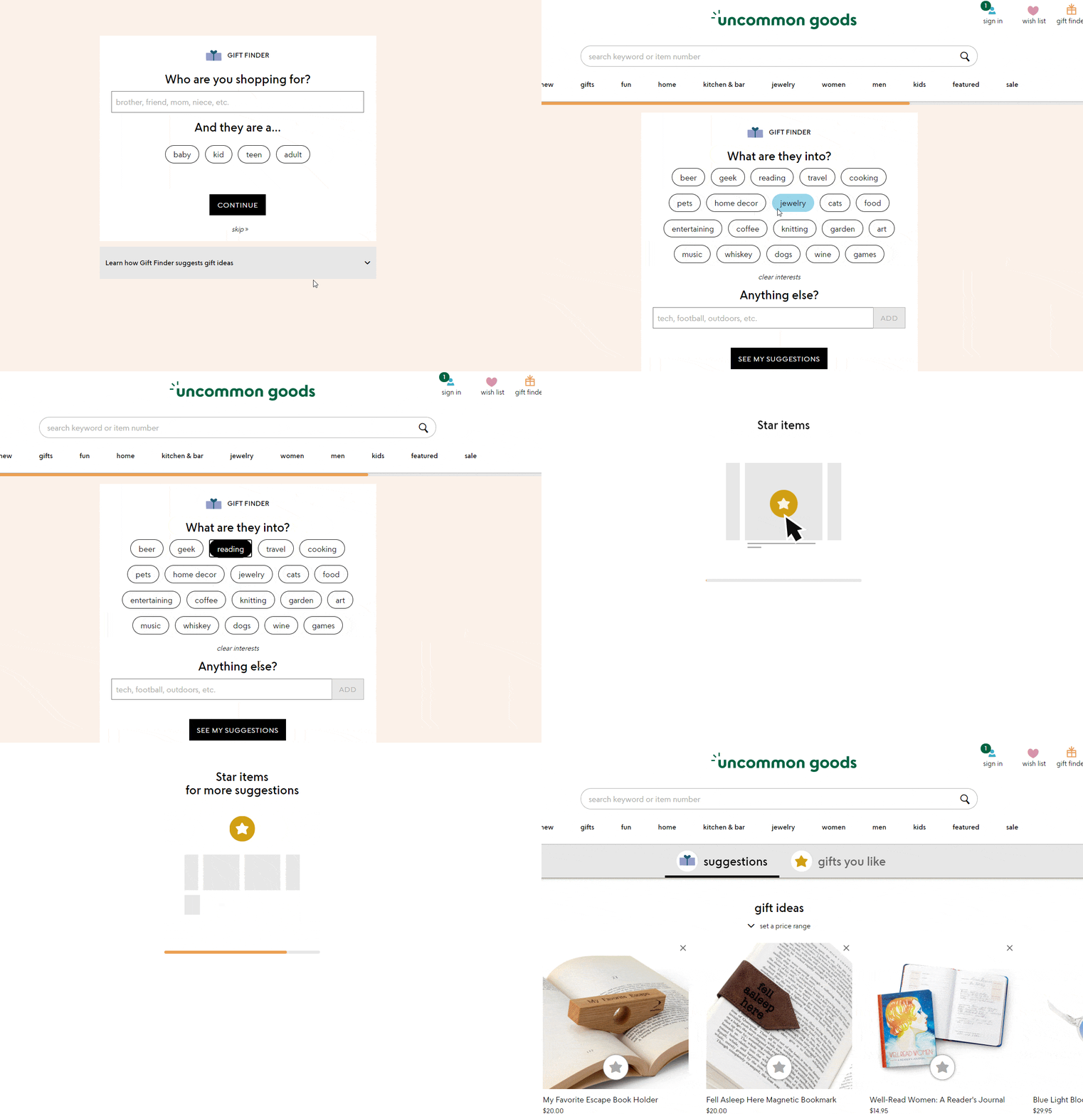
Key takeaway: always focus on user pain points
The big takeaway here is: each visitor to your PPC landing pages is a real person looking to solve a real problem, so design your landing pages for them . View the problem from their perspective, and design your PPC landing page to deliver the relevant value. Of course, the conventional paid search landing page best practices are important, but don’t fall into the “paint-by-numbers” trap.
Contextualise your pages to focus on user pain points and drill down to a level of specificity that speaks to where your visitors are in the buyer's journey. Experience has shown that taking a user-centric and technically relevant approach can have a major impact on your overall conversion rate.
This article is by Shaian Nouri, Kurve’s Paid Search Consultant.
Shaian Nouri is Kurve’s Paid Search Consultant, managing and validating PPC campaigns for clients in a range of different industries. If you need help powering growth through paid search or display advertising channels, contact Kurve.
