Your app icon is the first thing potential users see. It's the storefront of your mobile app, and the first impression counts.
Optimizing your app icon isn't about making it pretty. It's about designing a symbol that resonates, informs, and encourages clicks. A well-optimized icon can skyrocket your app's visibility, drive more downloads, and boost user engagement.
If you're wondering how to nail the perfect design, this article will share actionable tips to transform your app icon into an attention-grabbing asset. With Kurve's expertise in mobile app marketing, you'll discover how a compelling app icon can be a game-changer for your brand's growth.
Let's dive into the art and science of app icon optimization.
The Importance of App Icons in Mobile App Design and User Engagement
App icons hold a significant place in the mobile app store engagement landscape. When users scroll through an app store packed with thousands of options, the icon is the first thing that grabs their attention.
A well-crafted app icon communicates. It speaks volumes about a brand's essence, setting expectations about what lies inside. The colors and design can spark curiosity, reflect professionalism, and convey the app's core purpose. It's not only about aesthetics; it's about generating trust and setting the stage for user engagement.
But how can one ensure their app icon stands out and resonates with potential users? The process is both an art and a science. Our team at Kurve specializes in that blend. We understand the nuances of creating impactful icons that reflect an app's core identity and are vital in enhancing user experience. An influential app icon can be a game-changer with the right design approach, driving user engagement and success.
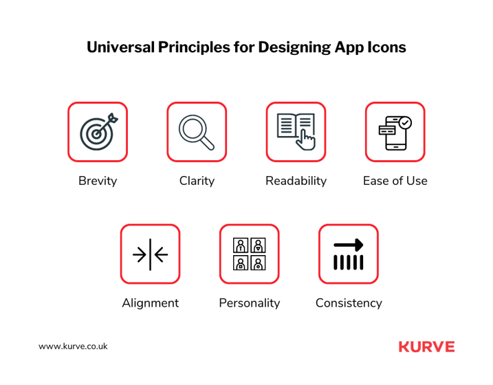
Universal Principles for Designing App Icons
So, app icons are a big deal in the world of apps. But how do you make a great one? Well, there are some rules to follow.
These aren't random tips. They're trusted design rules that help ensure your app icon looks good and does its job. If you want your app to get noticed, these rules can help.
Let's take a look at these rules one by one. Each rule or principle will show you how to shine your app icon.
Scalability
Size matters, especially for app icons. Imagine your app icon playing on a big screen. Looks good. Now think smaller. Much smaller. Would it still be clear on a tiny smartphone screen? That's the essence of scalability. Your design should shine through on a giant monitor or a wristwatch screen.
Complex designs can lose their charm when shrunk down. But simple designs? They're the champs. They stay crisp and clear, no matter the size. Before finalizing, play around, see your design in multiple sizes, and make sure it always looks great.
Recognizability
An app icon is like a hello. It's the first thing users see, so it should introduce your app well. But you've got only a moment. Users scroll past quickly. That's where recognizability comes in. Can someone glance at your icon and get your app's vibe? That's the goal.
Think about popular apps. Their icons are instant giveaways. Yours should be the same. Make it clear. Distinct. Something that makes people think, "Ah, that's the one!" Keep it straightforward but effective.
Consistency
Imagine meeting someone in a winter jacket on a beach. Out of place, right? That's how users feel about inconsistent app icons. If your app screams fun and vibrant, but your icon is dull, it doesn't match up. It's jarring.
Consistency bridges the gap. Your icon should mirror your app's feel. Colors, design, mood – everything should align. If users feel a smooth transition from your icon to the app, you've nailed it. It reassures them and makes them feel they've made the right choice.
Uniqueness
Amidst all these millions of apps, how does yours pop? Simple: Be unique. There's a vast ocean of app icons out there. Yours needs to be the island that catches attention. The trick isn't to go wild. It's to be authentically you.
What's your app's essence? Is it core? Dive deep. Bring that out in your icon. It could be a color, a shape, or a theme. It's your app's signature. Celebrate it. Show it off. And watch your app shine.
Best Practices for Optimizing Mobile App Icon Design
It's evident how crucial the right approach to app icon design is. But while understanding these principles lays a solid foundation, the real game-changer comes in applying best practices specific to mobile app icon optimization.
So, let's dive deeper into these strategies. These aren't mere design tweaks. They are methods refined over time, each with a proven track record of boosting app visibility and engagement. With Kurve's insights and industry experience, let's navigate these best practices together and see how they can shape your app's journey to success.
Researching the Competition and Market Trends
When crafting an app icon, it's vital to research both the competition and prevailing market trends. Doing so doesn't mean copying others but understanding the larger environment in which your app exists.
Start by scanning the top charts in app stores. Take note of recurrent themes, color schemes, and design elements. Are there specific motifs or styles currently in vogue? Understanding these patterns can hint at what draws users.
It's crucial to identify what your competitors are doing. If you're launching a fitness app and notice a sea of green icons with leaf motifs, either embrace that trend or pivot to something different to stand out. The key is making informed decisions.
Actionable steps include:
- Compile a list of direct competitors and analyze their icons.
- Use tools like App Annie or Sensor Tower to gain insights into trending designs.
- Engage with user feedback. Often, reviews on competitor apps can shed light on what users like or dislike about app icons.
When Instagram redesigned its icon to the current gradient model, it was a nod to the trend of gradient designs but with a unique twist that kept its brand identity intact.
Incorporating market research into your design process ensures your app icon is trendy and holds its own against competitors.
Simplifying App Icons for a Clean and Minimalistic Design
A clean, minimalistic design has a beauty of its own. With app icons, 'less is more' often trumps complexity. Why? Because clarity ensures comprehension, especially when users scroll through an app store page.
Minimalism is about distilling the essence. For your app icon, this means boiling down its core identity to a single, powerful visual cue. Take Apple's native apps, for instance: the Camera app is a camera, and the Clock app, is a clock face. These are straightforward yet instantly recognizable.
But how can one embrace minimalism effectively?
- Focus on the essentials: A simple cloud or sun motif will suffice if your app is a weather tool.
- Use fewer colors: Two or three harmonizing shades are often more impactful than a rainbow palette.
- Avoid clutter: Text, intricate designs, or detailed graphics can confuse more than they convey. Stick to clean lines and shapes.
A brilliant example is Spotify's iconic green app icon with a simple, centered music note. Instantly recognizable, it embodies the power of minimalism.
Opting for a minimalistic approach can elevate your app's first impression. The quicker a potential user understands, the likelier they are to download. Remember, simplicity often shines the brightest in a world overwhelmed with information.
Optimizing Backgrounds with Colors that Convey App Purpose
Colors carry emotions, moods, and meanings and can speak volumes before a user opens your app. The background and color choice for app icons sets the stage for the entire visual, influencing perception and decisions.
The science of color psychology reveals how specific hues can evoke feelings or actions. For instance:
.png?width=717&height=560&name=Optimizing%20Backgrounds%20with%20Colors%20that%20Convey%20App%20Purpose%20(2).png)
- Blue: Conveys trust and professionalism. Think of apps like Facebook or LinkedIn.
- Red: Captivates attention and prompts action. Apps like YouTube or Netflix use this to their advantage.
- Green: Represents calm, growth, or finance. WhatsApp and Spotify tap into this.
When selecting a background color for your app icon:
- Reflect your app's core: If your app is about fitness, shades of green or blue suggest health and wellness.
- Consider visibility: Ensure the color contrasts nicely with other elements, making the icon pop amidst other apps.
- Test and retest: Sometimes, what looks good in design might not resonate with users. Always A/B test different color variations to see which performs better.
While the design and logo are essential, the background color can make or break your app icon's effectiveness. By choosing a color and icon background that aligns with your app's purpose, you're making a strong design choice and giving users a hint about what they can expect.
Enhancing Visibility with Borders
Borders around app icons act as visual amplifiers. Think of a painting in a gallery; the right frame can make the colors pop, the details stand out, and draw the viewer's attention.
When you introduce a border to your app icon, it serves a clear purpose. It pushes your same icon design forward, making it more noticeable even when surrounded by other icons, especially on cluttered home screens, where many apps are vying for attention.
But there's more to borders than visibility. They can also hint at your app's functionality or theme. A jagged or irregular border might hint at an app's creative or offbeat nature, while a sleek, even border can convey professionalism.
It's essential, though, to exercise restraint. The role of the border is to support, not overshadow, the main design. It's a delicate dance of ensuring the border enhances the app icon without overwhelming it.
A notable example is the WhatsApp icon.
The green speech bubble is recognizable, but the white border ensures it stands out against varied backgrounds, making it identifiable even in a rush. The border is a silent yet powerful tool, boosting recognition and enhancing visual appeal.
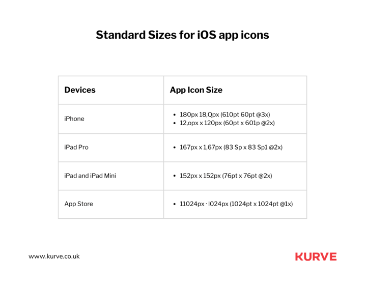
Ensuring Scalability and Sizing for Different Devices
In an era of diversifying screen sizes, from tablets to smartwatches, the adaptability of an app icon across devices is paramount.
It's like wearing a bespoke suit; it must fit impeccably, regardless of occasion or setting. The narrative of scalability and sizing goes beyond mere aesthetics. It's about ensuring seamless integration into the myriad digital ecosystems users navigate.

- Tailored to every screen: At the heart of scalability lies the art of customization. Every device's unique screen size and resolution presents a different canvas for your app icon. Crafting it such that it retains its charm and clarity, whether viewed on a 4K television or a smartwatch, is where the genius lies. The challenge is in maintaining detail with clarity.
- Pixel perfect precision: As you traverse from a larger screen to a smaller one, details can get lost or, worse, appear distorted. The meticulous attention to each pixel's placement can spell the difference between an icon that's blurry and sharp and crisp. Use vector designs to scale without losing quality as a foundational step.
- Adapt, don't shrink: A common mistake is shrinking an app icon for smaller devices. The result? Lost details and an unrecognizable mess. Instead, consider adaptive designs. On a larger screen, you can afford a more intricate design. But on a smartwatch, the core element of the icon suffices. Think of it as condensing the essence of your app for every screen.
- Testing across real devices: Emulators and mockups are great, but nothing beats the real thing. Test your app icon on various devices. Sometimes what looks splendid on a high-resolution monitor may resonate differently than on a mobile phone. Be prepared to iterate and refine based on these tests.
Keeping App Icons Simple and Communicative
When it comes to app icons, clarity is crucial. A simple yet impactful design ensures immediate understanding, a must-have when vying for user attention amidst countless icons.
But how do you strike the right balance?
- Prioritize core elements: Choose your app's most crucial feature or identity and make that the icon's centerpiece. A cloud or sun could be your primary symbol if your app is about weather updates. Strip away the non-essentials.
- Limit color usage: Stick to a palette of two or three complementary colors. Not only does this make your icon clean, but it also helps in brand recall.
- Ditch the text: Icons are visual. Including text, especially on such a tiny canvas, often leads to clutter. Rely on visuals to communicate.
- Keep it memorable: Simplicity doesn't mean being generic. Your icon needs to stick in users' minds. The trick is to combine familiar elements uniquely.
- Test with real users: Feedback is invaluable. Show your icon to a small group and gather their immediate reactions. This can help refine your design before it hits the app stores.
While the temptation to showcase everything might be high, restraint is vital. Let your app icon be a clear, straightforward representation of what your app offers, and you'll be on your way to catching more eyes in the app store.
Avoiding Excessive Text and Utilizing Logos Effectively
Text in app icons can be a slippery slope. The limited real estate of an app icon means every pixel counts. While a word or two might seem like a good idea, text can muddle the clarity, rendering it illegible, especially on smaller devices. Instead of trying to squeeze in a brand name or description, focusing on visual representation becomes imperative.
Enter the power of logos. Logos, when designed well, become synonymous with a brand's identity. A swoosh immediately brings to mind Nike, as a bitten apple evokes Apple Inc. When your app's logo can capture its essence and be instantly recognizable, you're on the right track.
When creating or choosing a logo for your app icon, it's essential to ensure it's scalable and reflective of its primary function or value proposition. Consider the nuances. If the logo has intricate details, it might be worth revisiting its design to suit the confines of an app icon.
Observing competitors and seeing how they're leveraging logos in their app icons is also beneficial. The goal isn't to mimic but to understand the balance they've struck between recognizability and representation.
In the end, the balance between text and logos in an app icon is a delicate one. It's about ensuring potential users can instantly connect the visual cue to your app's purpose or brand without the clutter or confusion text might introduce.
Updating App Icons for Seasonality and Localization
Changing your app icon with the seasons can make it feel fresh and timely. For example, adding snowflakes during winter or changing the color scheme to match fall can draw users in. It's a simple way to show your app is current and tuned in to the world around it.
When taking your app to international markets, tweaking your icon to suit local tastes is intelligent. Different cultures have varied symbols and colors they resonate with. Adjusting your app's icon to match a country's preferences can make it more appealing and relatable.
Remember to keep changes subtle. Your app's core look should remain recognizable to ensure existing users are clear. The key is balancing the familiar with the new, making your app feel fresh and reliable.
Following App Icon Guidelines of App Stores
Apple's App Store and Google's Play Store have meticulously crafted guidelines for app icons. These are designed to maintain a cohesive look across apps, ensuring users can navigate and identify them.
When you respect these guidelines, you optimize the visibility and appeal of your app. Ignoring them can result in your app being overlooked or even rejected. It might sound straightforward, but meeting these specifications requires attention to detail. Here are some examples:
- Each platform has specific sizing standards: While a particular dimension might work on one platform, it might appear stretched or compressed on another.
- Each platform prefers different shapes: Android now leans towards adaptive icons which can conform to different shapes depending on the device, whereas Apple sticks to its rounded rectangle.
- Each platform has nuances: Some app stores have recommendations against design elements that can be mistaken for system icons. Others might advise on the usage of shadows or gradients.
While these guidelines might seem restrictive at first, they're beneficial. They provide a framework for designers to innovate, ensuring their creations are distinctive and aligned with platform standards.
It guarantees smoother app store approvals, better platform visibility, and a consistent user experience.
Investing in App Icon Testing to Boost Downloads
App icons matter. They're like the cover of a book in the app store. If it grabs attention, people are more likely to download your app. So, how do you know your app icon design is a hit? Test it.
Use A/B testing. Show two different icons to separate groups of users and see which one gets more clicks. Simple. But this little test can give significant insights. One icon may remind users of a popular game. Or another color feels more trustworthy.
Your app might be excellent, but if the cover isn't inviting, people might scroll past it. So, don't guess. Test, learn, and then decide. That's how you get more downloads.
The Upshot Of Optimizing App Icons
An app's icon is more than just a pretty face; it's the gateway to your app's world.
Mastering this craft means you're not designing - you're communicating. You've now acquired the tools to create icons that beckon, articulate, and endure in the user's mind.
But excellence is a journey, not a destination. To succeed, consider the expertise of those who've been there and done that. Kurve's marketing consulting has a proven track record in this arena. Want proof? Check out Kurve's app store optimization success stories and see how our insights have helped mobile apps grow faster.
With the right icon and strategy, your app isn't just on the map; it's the destination everyone wants to visit.